
Una part de la societat nordamericana del segle passat va acollir amb entusiame els intel·lectuals europeus que fugien del feixisme i de la guerra. La parella formada per Alvin i Elaine Lustig pertanyien a aquest sector culte i progressista que creia ferventment en l’ideari modern representat per l’arquitectura d’avantguarda i l’art abstracte. Les cobertes que Alvin Lustig va crear per l’editorial New Directions testimonien un profund coneixement dels moviments artístics de principis del segle XX. El seu objectiu era, certament, seduir el lector per incrementar les vendes, però recorrent sempre a referents cultes. Art i comerç en una nova unitat.
Després de la seva prematura mort l’any 1955, la seva esposa Elaine va continuar aquesta tasca gràfica en el món editorial, fidel als principis avançats en els que havia estat formada. Amb el seu segon marit, l’autor i editor Arthur Cohen, va fundar el 1973 la llibreria antiquària Ex Libris, especialitzada en llibres i impresos de les avantguardes històriques. Així va poder conèixer de primera mà l’obra dels artistes i dissenyadors als que tant admirava. Al llarg de la dècada de 1970 va anar abandonant gradualment l’activitat com a grafista per dedicar-se en exclusiva a la creació artística.
Més informació sobre Alvin Lustig al web del Fons de Reserva Enric Bricall
Més informació sobre Elaine Lustig Cohen al web del Fons de Reserva Enric Bricall
_
Una parte de la sociedad norteamericana del siglo pasado acogió con entusiamo a los intelectuales europeos que huían del fascismo y de la guerra. La pareja formada por Alvin y Elaine Lustig pertenecían a este sector culto y progresista que creía fervientemente en el ideario moderno representado por la arquitectura de vanguardia y el arte abstracto. Las cubiertas que Alvin Lustig creó para la editorial New Directions son testimonio de un profundo conocimiento de los movimientos artísticos de principios del siglo XX. Su objetivo era, ciertamente, seducir al lector para incrementar las ventas, pero recurriendo siempre a referentes cultos. Arte y comercio en una nueva unidad.
Después de su prematura muerte en 1955, su esposa Elaine continuó esta tarea gráfica en el mundo editorial, fiel a los principios avanzados en los que había sido formada. Con su segundo marido, el autor y editor Arthur Cohen, fundó la librería anticuaria Ex Libris, especializada en libros e impresos de las vanguardias históricas. Así pudo conocer de primera mano la obra de los artistas y diseñadores a los que tanto admiraba. A lo largo de la década de 1970 fue abandonando gradualmente su actividad como grafista para dedicarse en exclusiva a la creación artística.
Más información sobre Alvin Lustig en la web del Fons de Reserva Enric Bricall
Más información sobre Elaine Lustig Cohen en la web del Fons de Reserva Enric Bricall
“Designers in the U.S. gained increasing access to information about the avant-garde during the 1930s, when many artists and intellectuals emigrated from Germany. Laszlo Moholy-Nagy, Walter Gropius, Herbert Bayer, and Ladislav Sutnar moved to America, where they practiced and promoted modernist design methodologies. Their progressive ideas were met with excitement by a small community of designers in the U.S., including Alvin Lustig and Lester Beall, who interpreted concepts from Dada, Futurism, Constructivism, and Surrealism in the context of American culture. This commercial vanguard helped lay the foundation for the modern profession of graphic design in the U.S., which dramatically expanded during the post war period and profoundly changed the appearance and function of American media. Principles of abstract composition, symbolic forms, and expressive typography were applied to books, magazines, and corporate identity.”
Ellen Lupton, Elaine Lustig Cohen. Letters from the avant-garde: modern graphic design. New York: Princeton Architectural Press, 1996 (p. 88)
“La ilustración a partir de formas abstractas, ya sean patrones geométricos o formas biomórficas, se emplea a menudo para representar un tono o emoción. El trabajo de Alvin Lustig es un ejemplo emblemático de ello. Durante décadas trabajó para New Directions y consiguió transmitir un espíritu de contemporaneidad y modernidad a la imagen editorial de la casa.”
Rosa Llop. Un sistema gráfico para la cubierta de libros: hacia un lenguaje de parámetros. Barcelona: Gustavo Gili, 2014 (p. 59)


“Lustig’s jacket design for New Directions demanded contemplation; they were not just point-of purchase visual stimulants”
Steven Heller, Elaine Lustig Cohen. Born modern: the life and design of Alvin Lustig. San Francisco: Chronicle Books, 2010 (p. 55)
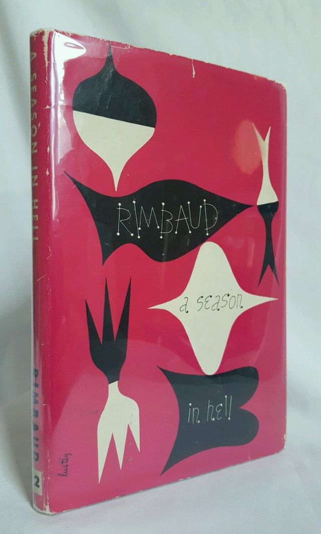
Arthur Rimbaud. A season in hell. New Directions, 1945
“Lustig’s work for New Directions began in 1940 and continued until 1952, during which time publisher James Laughlin granted him complete creative freedom. For each jacket design, Lustig, for whom form and content were so inextricably linked as to be indistinguishable, began by reading the text. Once he had a sense of the author’s intent, he set out to create visual representations of the book’s essence, sometimes literal reflections of the subject of the story and at other times highly subjective and abstract interpretations. What ties the series together is not so much a recognizable treatment -indeed, each jacket design is distinctive- but Lustig’s approach to representing the “spirit” of each book. Although the “New Classics” series reflects his unapologetically modern sensibilities, Lustig saw his contribution as restoring a visual richness that was an essential part of the tradition of book-making.”
Graphic: 500 designs that matter. London: Phaidon, 2017
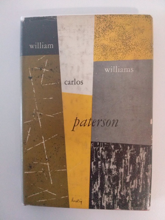
William Carlos Williams. Paterson. New Directions, 1950
“This professional association of designer and publisher helped to inspire one of the most formidable series of book covers in twentieth-century American design, the New Directions New Classics. In the 1940s and 1950s Lustig designed dozen of covers for New Directions and other prominent progressive publishers. He explained his goals in these designs: the primary intention in designing the book jackets of the New Directions Series, was to establish for each book a quickly grasped, abstract symbol of its contents that would be sheer force of form and color, attract and inform the eye. Such a symbol is a matter of distillation, a reduction of the book to its simplest terms of mood or idea. This spirit of the book cannot be expressed by naturalistic representations of episodes or by any preconceived formal approach, but can only develop naturally from its own nature.”
Ned Drew, Paul Sternberg. By its cover: modern American book cover design. New York: Princeton Architectural Press, 2005 (p. 46)
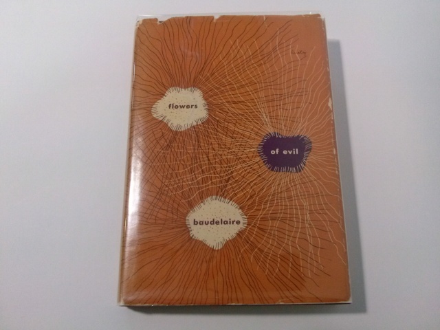
Charles Baudelaire. Flowers of evil. New Directions, 1946
“Alvin Lustig (1915-1955) changed the look of book jackets in the mid ‘40s through his practical application of modern art and modern typography. Lustig introduced photomontage to American jackets as a mean of giving the two-dimensional surface a three-dimensional illusion. His series of illustrated jackets for New Directions Classics took the abstraction of Miró, Mark Rothko, and others to the limits of applied art.”
Steven Heller, Seymour Chwast. Jackets required: an illustrated history of American book jacket design, 1920-1950. San Francisco: Chronicle Books, 1995 (p. 114)

Djuna Barnes. Nightwood. New Directions, 1945
“Lustig’s most striking jackets present complex contrasts between fields of color, line and form, image and text. His jacket for Djuna Barne’s Nightwood is composed of an asymmetrical balance of jagged shapes like those in Clyfford Still’s paintings, juxtaposed with thin calligraphic strokes and dense, aggressive masses of tangled lines.”
Ned Drew, Paul Sternberg. By its cover: modern American book cover design. New York: Princeton Architectural Press, 2005 (p. 46)
“Lustig’s cover for Djuna Barnes’s experimental novel Nightwood, about obsessive love, represents the book’s theme by the interplay of lines, fluid shapes and menacing knots of scribble. It is both a piece of communication design and a work of art in its own right.”
Rick Poynor. “Digital history book”. Eye, nº 59, vol. 15, 2006

Stephen Mallarmé. Poems. New Directions, 1949
“I often wish that Lustig had chosen to be a painter. It is sad to think that so many of his designs must live in hiding on the sides of books on shelves. I would like to have his beautiful Mallarmé crystal or his Nightwood abstraction on my living room wall. But he was compelled to work in the field he chose because he had had his great vision of a new realm of art, of a wider social role for art, which would bring it closer to each and every one of us, out of the museums into our homes and offices, closer to everything we use and see.”
James Laughlin. “The book jackets of Alvin Lustig”. Print Magazine, Oct/Nov 1956

Franz Kafka. Amerika. New Directions, 1946
“Each of Lustig’s New Classics jackets is a curious mix of expressionistic and analytical forms which interpret rather than narrate the novels, plays or poetry contained within. For Franz Kafka’s Amerika, he used a roughly rendered five-pointed star divided in half by red stripes, out of which emerge childlike squiggles of smoke that represent the author’s harsh critique of a mythic America.”
Steven Heller. “Born modern”. Eye, nº 10, vol. 3, 1993

Henry James. The Aspern papers; The Europeans. New Directions, 1950
“While a cover such as the one Lustig designed for Henry James’s The Aspern Papers and The Europeans, with its disciplined geometric composition and subtle shifts in earthy tones, may have been reminiscent of El Lissitzky or Kandinsky, Lustig adapted their visual language to make it his own.”
Ned Drew, Paul Sternberger. Purity of aim: the book jacket designs of Alvin Lustig. Rochester: Rochester Institute of Technology, 2010 (p. 37)

D. H. Lawrence. The man who died. New Directions, 1947
“In Lustig’s designs, one can find compositions echoing the biomorphic shapes of Calder, Miró and Gorky, the glyph-like forms of Klee, the early work of Gottlieb and Pollock, and the fields of abstract color of Still and Rothko (…) As easy as it is to find stylistic similarities between his designs and movements in modern art, Lustig’s engagement with modern art was not simply an integration of art styles into design, but rather it was the integration of the creative process of art into design.”
Ned Drew, Paul Sternberger. Purity of aim: the book jacket designs of Alvin Lustig. Rochester: Rochester Institute of Technology, 2010 (p. 39)

Federico García Lorca. Selected poems. New Directions, 1953

Hermann Hesse. Siddhartha. New Directions, 1951
“Siddhartha’s life in Herman Hesse’s novel flows like a river, its essence captured in Alvin Lustig’s book jacket design (…) Here, as in Lustig’s other book jacket designs, he responds abstractly to the text, not embracing literal depiction. Embodying a river’s essence, the image suggests alternate readings too, including an eye with contours of energy emanating along the curves of a face. As a painter of transitory reflections in water and glass, and of faces too, I am transfixed by Lustig’s image, and lulled towards new insight into Hesse’s text.”
Pamela Lawton. River glimmered. Cooper Hewitt, 2003 https://www.cooperhewitt.org/2013/07/09/river-glimmered/

Carl Rakosi. Selected poems. New Directions, 1941
“A transitional figure, Lustig’s career alternated between California and New York. For an emerging designer such as Lustig, the architect Frank lloyd Wright was an important influence. Although Lustig eventually studied briefly with Frank Lloyd Wright, he was largely self-taught. His graphic design in the late 1930s, created with the forms from the printer’s type case, reflected the impact of Wright’s style.”
Roger Remington, Lisa Bodenstedt. American modernism: graphic design, 1920 to 1960. New Haven: Yale University Press, 2003 (p. 112)

William Faulkner. Light in August. New Directions, 1946 (Modern Reader Series)
“An opportunity for Lustig to expand beyond his experimentation with the abstracted symbols of the New Classics series came with the inauguration of New Directions’ Modern Reader Series (…) In his covers for the Modern Reader Series, Lustig wanted to create a new graphic vocabulary that would set it apart (…) For the Modern Reader Series, Lustig chose an approach that integrated type, geometric forms and photographic elements.”
Ned Drew, Paul Sternberger. Purity of aim: the book jacket designs of Alvin Lustig. Rochester: Rochester Institute of Technology, 2010 (p. 50-52)

Tennessee Williams. The rose tattoo. New Directions, 1951 (Modern Reader Series)
“In a self-conscious distillation of his repertoire of design elements, Lustig began to incorporate type as a concrete design element in and of itself, shunning the suggestive imagery of the New Classics series or the evocative photographs of the Modern Reader Series.”
Ned Drew, Paul Sternberger. Purity of aim: the book jacket designs of Alvin Lustig. Rochester: Rochester Institute of Technology, 2010 (p. 66)

Federico García Lorca. 3 Tragedies. New Directions, 1948 (Modern Reader Series)
“Lustig also experimented with the integration of photographs into the design of his covers, creating the challenge of reconciling the transcriptive, literal visual information of the photograph with the goals of the design as a whole. His 1947 cover for Federico García Lorca’s Three Tragedies creates a formal interplay of lights and darks, sharp angles and delicately curved shapes. The textures in the photographs play off one another, and the text written in the sand becomes a seamless marriage of type and photographic image. The juxtaposed photographs suggest themes that connect the images. The moon, waves, and beach combine to conjure up associations with the cycles of the tides and the passage of time. The impermanence of the writing in the sand creates a tension between natural forces and the intellectual and belief structures suggested by the symbols of culture. These tensions, both formal and conceptual, eccho the opposing forces in Lorca’s plays in which the characters are driven by human passions that collide with social and religious principles. Lustig orchestrated a visual poetry of subtle association that transcends literal illustration.”
Ned Drew, Paul Sternberg. By its cover: modern American book cover design. New York: Princeton Architectural Press, 2005 (p. 49)
“Although Lustig would probably have considered it but a small part of his overall output, no single project is more significant in the history of modern book covers, and possibly graphic design in general, than Lorca 3 Tragedies (1948). It is a masterpiece of symbolic acuity, compositional strenght, and impromptu lettering. Moreover, the late twentieth century preference among American book jacket designers for contiguous interrelated images, photo-illustration, expressionist typography, and rebus-like compositions can be traced directly to Lustig’s black-and-white cover for Lorca.”
Steven Heller, Elaine Lustig Cohen. Born modern: the life and design of Alvin Lustig. San Francisco: Chronicle Books, 2010 (p. 62)

Herbert Read. The philosophy of modern art. Meridian Books, 1955 / Joseph Schumpeter. Social classes; Imperialism. Meridian Books, 1955
“The stenciled type on Lustig’s cover for Herbert Read’s Philosophy of Modern Art, with its rhythm of alternating yellow and white components, gave a sense of aestheticized utility. Reflecting read’s theories, and his own, Lustig’s stenciled type, combined with the cover, evoked a role art that could be at once refined, accessible, and serve society. Playing on ideas of class distinction in Joseph Schumpeter’s essays Imperialism and Social Classes, Lustig set “Social Classes” in a decorative white script that contrasted with the imposing, all-capital, black, sans-serif “Imperialism”. The field of purple invited associations with royalty, while the position and color of the “2” suggested an imperial crown and helped to identify the text as two distinct essays. These typographic covers, with their subtle mixture of typefaces on colored or patterned backgrounds, are simplified but not simplistic, bold but not stark, refined but not sterile. His idiosyncratic amalgams of different typefaces defied a pure modernist idiom and foreshadowed the eclectic use of historical styles in American design of the 1960s and the postmodernist pastiche of the 1980s.”
Ned Drew, Paul Sternberger. Purity of aim: the book jacket designs of Alvin Lustig. Rochester: Rochester Institute of Technology, 2010 (p. 67)

Industrial design in America, 1954. Farrar, Straus & Young, 1954
“Like several other designers of his generation, Lustig actually signed his work, in handwriting, laying claim to his personal interpretation, his conceptual work, which in his case is not always so formally consistent that it could be recognized without his signature. In Lustig’s work one sees an essential American variant on modernist graphic design (…) What’s “functional”, as interpreted by this first generation of American graphic designers, is truly connected to what is needed to “do the job” in terms of conveying an idea both visually and verbally, simultaneously, and is not necessarily keyed to the use of specific fonts, colors, or forms (…) This attitude accurately reflects what was going on in design teaching, as new pedagogic approaches at schools such as the Institute of Design in Chicago, Massachusetts Institute of Technology, and Black Mountain College in North Carolina emphasized the combination of conceptual work in concert with forms influenced by the entire range of avant-garde design and art activity, included abstract painting.”
Elizabeth Armstrong. Birth of the cool: California art, design, and culture at Midcentury. Newport Beach: Orange County Museum of Art, 2007 (p. 158-159)
Elaine Lustig Cohen

Will Herberg (ed.). The writings of Martin Buber. Meridian Books, 1956

Tennessee Williams. Baby Doll. New Directions, 1957
“In her covers for Meridian Books and New Directions, designed from 1955 through 1961, Elaine Lustig Cohen used abstract structural elements, expressive typography, and conceptual photographs to interpret the books’ contents. Working at a time when most book covers employed literal pictorial illustrations, Cohen visualized titles in contemporary literature and philosophy through a rich variety of approaches, from stark abstractions and concept-driven solutions to obtuse evocations that bring to mind the recent work of Chip Kidd and Barbara de Wild for Knopf.”
Ellen Lupton. Elaine Lustig Cohen, Modern Graphic Designer http://elainelustigcohen.com/modern-graphic-designer/
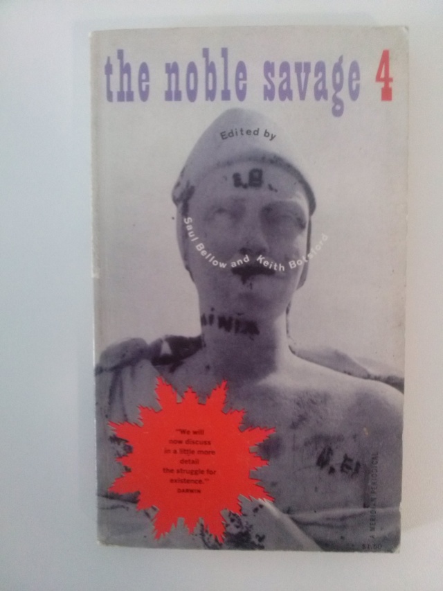
The Noble Savage, 4. Meridian Books, 1959
“Her book covers range from the photographic, to the abstract, to the typographic and various combinations thereof. The knowledge she absorbed from Lustig and the ideas she inherited from avant-garde art movements including Constructivism, Dadaism, Futurism, Surrealism and the Bauhaus enabled her to experiment freely (…) The Noble Savage (1959) was a literary periodical of contemporary short stories, poetry and essays, edited by writers Saul Bellow and Keith Botsford. For Issue 4, she used her own black and white image of a worn statue and playfully decorated it with the editors’ names in the shape of a moustache, a nod to her Dada influences. Her choice of purple (a noble color), animated starburst and wood type make this cover witty, eye-catching and amusing.”
Patricia Belen, Greg D’Onofrio. “Elaine Lustig Cohen The Art of Modern Graphics”. The Shelf Journal, Issue 2, 2012

David Shapiro. January. Holt Rinehart & Winston, 1965

A New Aesthetic. Washington Gallery of Modern Art, 1967
“Working for Meridian until 1962, Elaine designed over 100 book covers including an additional 50 (until 1969) for publishers such as Doubleday, George Braziller, Holt Rinehart & Winston, the Jewish Museum and New Directions. Her book covers are neither mass market or overly conceptual – they thrive somewhere in between. Yet, her designs are a high point of book publishing of the 1950s and 60s, a unique style of American modernism characterized by inventiveness, playfulness and clarity.”
Patricia Belen, Greg D’Onofrio. “Elaine Lustig Cohen The Art of Modern Graphics”. The Shelf Journal, Issue 2, 2012

USA XXXII Biennale Venezia. The Jewish Museum, 1964

Masada. The Jewish Museum, 1968
“Elaine’s ability to think conceptually and experiment with type and form made her an apt choice for designing the catalogs to compliment the Jewish Museum’s commitment to contemporary art. Her designs are as minimal and abstract as the work they represent. Instead of solely displaying the name of the artist or exhibition, she used the catalog covers as mini canvases to reflect the spirit of the exhibition or pay homage to the artist’s style. Knowingly or not, Elaine created a unique and vibrant graphic personality for the museum.”
Patricia Belen, Greg D’Onofrio. “Elaine Lustig Cohen The Art of Modern Graphics”. The Shelf Journal, Issue 2, 2012

Primary structures. The Jewish Museum, 1966
“One technique she continued to use was her abstract representational approach practiced in her book cover designs. Primary Structures was the Jewish Museum’s landmark, somewhat controversial, 1966 exhibit that defined minimalist artists working in contemporary sculpture, notably Donald Judd, Robert Smithson, Sol Lewitt, Dan Flavin and Ellsworth Kelly. On the catalog cover, a stripped-down white “P” and integrated red “S” on an intense yellow background, are interpretations of the fluorescent light installations and the shiny, smooth sculptural forms included in the exhibit.”
Patricia Belen, Greg D’Onofrio. “Elaine Lustig Cohen The Art of Modern Graphics”. The Shelf Journal, Issue 2, 2012

Constructivism & futurism: Russian and other. Ex Libris, 1976
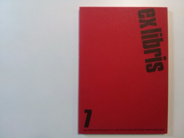
Ex Libris 7. Ex Libris, 1977

Bauhaus. Ex Libris, 1979

